
Your formatting choices can make or break your financial statement's effectiveness. Good formatting helps a report communicate more clearly by drawing attention to essential information and showing relationships between items, while bad formatting can overwhelm and confuse users and make it harder for them to determine which pieces of information to focus on. This blog is the second of a three-part series on how to create better financial statements:
Part 1: 6 Elements of a Good Financial Design Statement
Part 2: Formatting Best Practices for Financial Statements
Part 3: Data Visualizations for Financial Statements
Color choices
The fewer colors you use, the better, so pick just a few colors and stick with them. To help cut down on the number of colors in your report, try to use a monochromatic color scheme rather than many different hues. Using the colors in your company's logo can make your reports look polished and professional. Once you choose your colors, you need to decide how to use them. Darker colors are best for large blocks of numbers or text, brighter colors are good for drawing attention to important items, and pastel shades are good for highlighting words or as background colors. When you choose to use a color, use it consistently. Using the same color to say the same thing every time will reduce confusion in your audience.
When choosing colors, be sure to keep cultural color interpretations in mind. In the U.S., green usually indicates positive or "good" information, while red usually indicates negative or "bad" information. If your company operates internationally, consider your color choices in the context of all the cultures your company interacts with, not just your own.
Consider how your reports will look to colorblind users and how they will look if printed in black and white. In addition to varying the saturation rather than the hue, use patterns or symbols alongside colors. For greater legibility, consider how the font color and background color interact. Use dark words on a light background or vice versa.
Fun with Fonts
Just like with color, fewer is better. One font may be plenty! Consider using bold, italicized, or underlined text instead of switching fonts, and be consistent about how you use them. Examine how your chosen fonts will look in a variety of settings: in print, on a computer screen, projected onto a screen in the conference room, etc. Serif fonts (like Times New Roman) are better for small paragraphs of text and are easier to read in print. Sans serif fonts (like Arial) are easier to read from a monitor or from a distance and are generally easier to read for dyslexic people.
Numeric Formatting
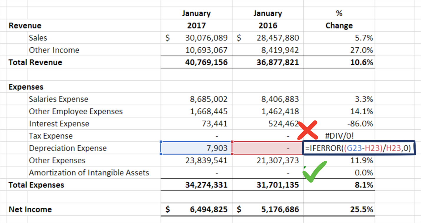
Numbers should be right-aligned for easy comparison. In Excel, only the first and last rows should use accounting or currency format to show the currency symbols. All other rows should use comma format. If you're using percentages, use only one decimal place. For dollar amounts, round to the nearest dollar. Your users will rarely (if ever) need to know the exact amount down to the cent. If you do opt to include decimals, use them everywhere for consistency. If your KPI calculations are getting unsightly error messages (for example, dividing by zero), you can use Excel's IfError function to hide them.
Other Considerations
Remember that gridlines do not print by default in Excel. If you want to include them on a printed report, check the Print box in the Gridlines section of the Page Layout ribbon. Or, if you don't want the gridlines to be visible while viewing the Excel document, you can uncheck the View box in the same spot. In general, wider, more complicated reports need gridlines to help users tell which numbers go with which row descriptions, while narrower, less complicated reports do not need gridlines.
If you're using total lines, keep their formatting and location consistent. Always include column headers with relevant information such as dates, period numbers, and any relevant information about the division, location, type of KPI, and so forth. Row descriptions should be informative and left-aligned. Use indents, fonts, or colors to highlight section titles and totals.
How ActivReporter makes formatting your reports easier
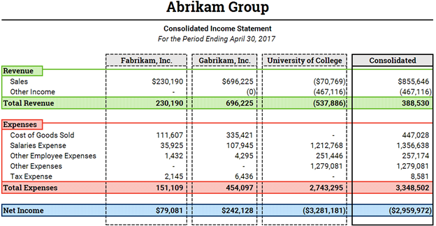
Because ActivReporter is fully integrated with Excel, you have access to all the formatting choices Excel provides, including conditional formatting and built-in currency formats. There's no need to learn how to use new formatting tools or a new toolbar layout because you're probably already familiar with Excel. For example, here is an income statement created with ActivReporter:
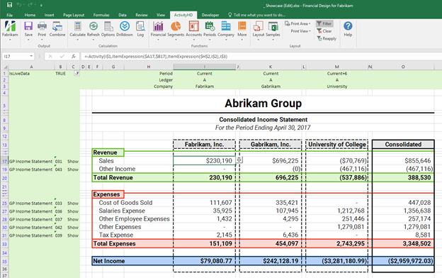
And here is how it looks while being built in Excel. What you see is what you get! No more going through the cycle of fixing a report, running a report to see if it's actually fixed, then going back to fix it again. No more exporting to Excel to reformat the same report the same way every month. With ActivReporter, you start in Excel, use added functions to pull in GP general ledger data, format it how you want, and then publish month after month without needing to make manual changes.
During our series on how to create better financial statements we've talked about FASB's qualitative characteristics of useful financial information, and the differences in purpose between financial and management reporting, looked at various data visualizations, and in this blog, shared some best practices for formatting both types of reports. Now you should be ready to present your financial designs to your team!