
While the numbers in your reports are the stars of the show, many of your users, especially those not in the finance department or accounting, will benefit from seeing a visual representation such as a chart or a graph. Visuals help put numbers in context, letting your users see the bigger picture and spot trends more easily. However, if you use visuals incorrectly, they can confuse and mislead your users instead. It's very important to use the correct visual for the information you want to convey. This blog is the last of a three-part series on how to create better financial statements:
Part 1: 6 Elements of a Good Financial Design Statement
Part 2: Formatting Best Practices for Financial Statements
Part 3: Data Visualizations for Financial Statements
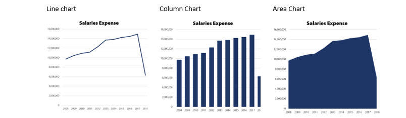
Showing Trends
If you need to show how your data changes over time, your best options are a line chart, a column chart, or an area chart. These charts show a visual progression over time, making acceleration, deceleration, and volatility more visible. Also, they will be easy for your users to read and interpret because they are familiar.
Showing Composition
If you need to show how different subcategories of data form a larger category, you can use a pie chart, a stacked column chart, or a stacked area chart. These give users a good visual idea of how the different pieces compare to one another along with the totals.
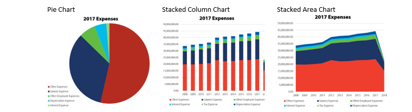
You can also use a lesser-known chart, called a waterfall chart, which shows how each positive and negative amount contributes to a total. Or, in accounting terms, a waterfall chart begins at zero, shows revenues moving the total up and expenses moving the total down, until finally the total, net income, is shown in relation to the starting point, zero.

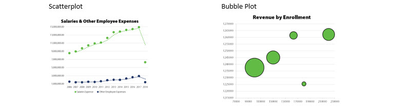
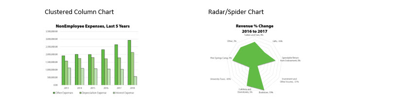
Showing Comparison
If you need to show how different amounts compare to one another, you can use a scatterplot, a bubble plot, a clustered column chart, or a radar chart (also known as a spider chart). These are good for comparing revenues or expenses for different departments, locations, and so on.
How ActivReporter makes data visualization easier
Since ActivReporter integrates with Excel, you have access to Excel's easy-to-use chart tools. Excel can create any chart you want directly from your data with just a few clicks. You have full control over the color, style, and placement of your charts. And, since the charts depend on your data from GP, they will always be up to date.
During our series on how to create better financial statements we've talked about FASB's qualitative characteristics of useful financial information, and the differences in purpose between financial and management reporting, we shared some best practices for formatting both types of reports, and in this blog, we looked at various data visualizations. Now you should be ready to present your financial designs to your team!