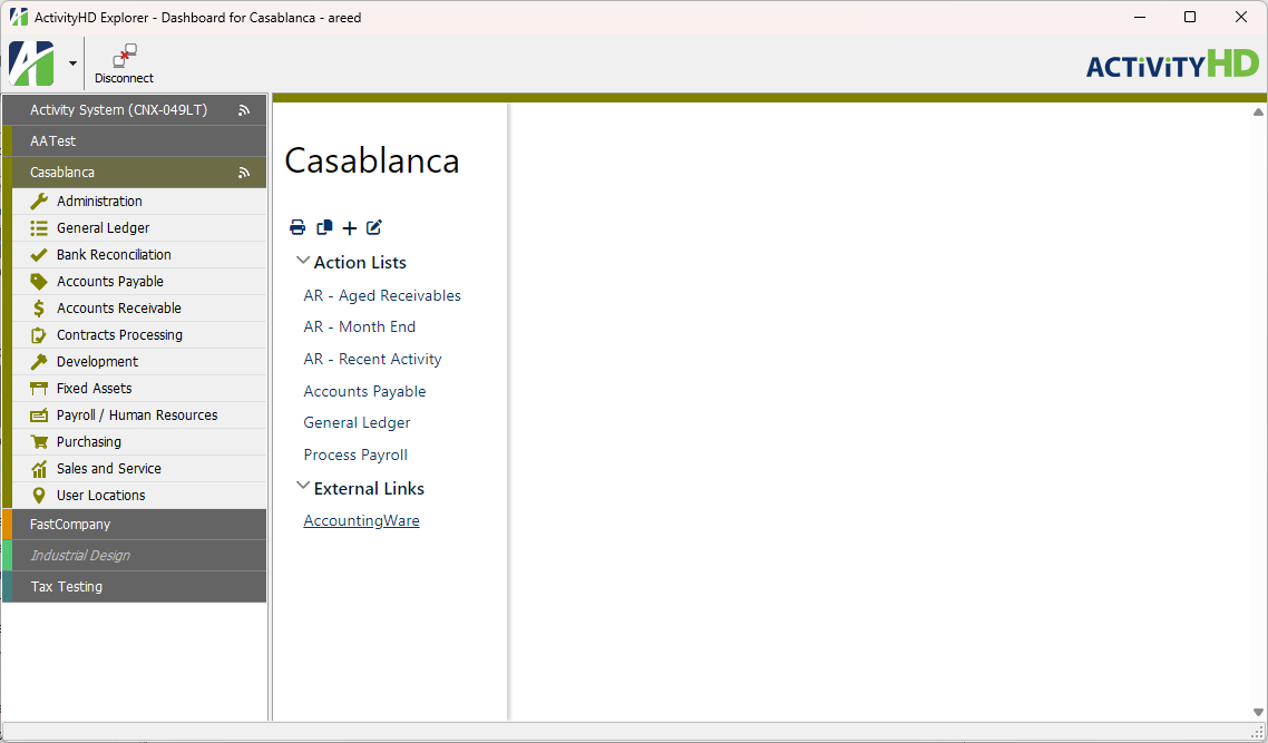
A dashboard in ActivityHD is an embedded web page which is accessed by highlighting the ActivityHD System folder or a company folder. A dashboard contains a variety of objects called "gadgets". Dashboard gadgets provide quick access to ActivityHD data and ActivityHD functions by bypassing the folder navigation. Gadgets can even be used to access external applications such as your Outlook calendar. Because the dashboard with its gadgets is interactive, your key personnel can get a snapshot of periodic activity for any department or for overall operations. For instance, you can access accounting reports, view open and past due transactions, process payroll, or even view important reminders from your Outlook calendar. The dashboard can be customized for an individual or a department based on responsibilities and routine processing.
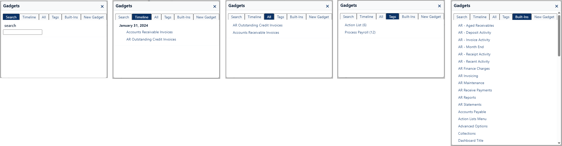
The ActivityHD system and each company has a Gadgets folder at Administration > Setup > Gadgets from where you can create and maintain your gadgets. Some packages include built-in gadgets. Gadgets can be shared among users and copied to other companies. Your ability to see a particular gadget is controlled by the permissions assigned to the gadget and the permissions assigned to you.
Tip
ActivityHD includes a built-in gadget called "Markup". This gadget record contains two articles, "Markup" and "Table Markup", which contain sample markup syntax for you to learn from. The default access for this gadget is "All", but can be changed if you don't want the sample articles on your dashboard.
Create a gadget
Gadgets start as a new "article" in which you write instructions that provide a link to run a report, open a folder window, etc. When you save the article, it becomes a gadget on your dashboard. There are several ways to customize a gadget to change how it looks on the dashboard.
To create a new gadget from the dashboard:
- Highlight the company folder for the company you want to create a gadget for.
- Click the
 icon below the company name in the dashboard.
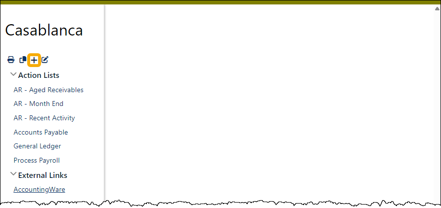
The Gadgets dialog opens.
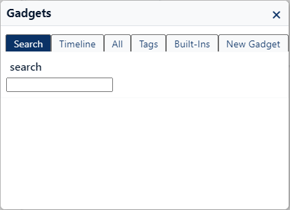
- Select the New Gadget tab.
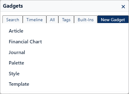
- Click Article. A New Article container opens.
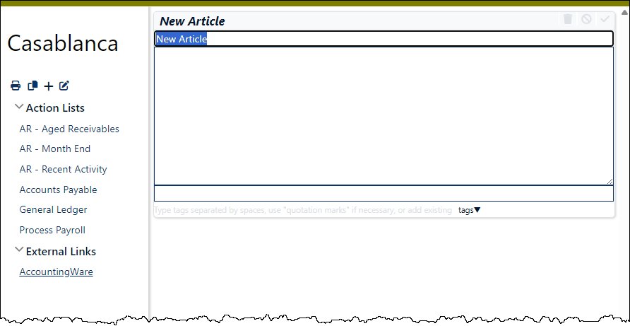
- In the New Article field, enter a meaningful name for the gadget. Consider using a naming convention that will make it easy to locate the gadget in a long list.
-
In the text box, compose the article by entering statements which define the function of the gadget. Use gadget syntax.
Tip
Use comments liberally in your articles. Comments will help refresh your memory the next time you take a look at the article, and comments will help another user understand your article better.
To enter a comment, type /% at the start of the comment and %/ at the end.
-
In the field below the article text box, optionally enter tags to use to categorize the gadget or select existing tags from the tags drop-down list. Single word tags can be separated with spaces. Multi-word tags must be enclosed in double brackets [[ ]] or double quotes and separated from other tags with spaces.
Tip
To automatically add the gadget to the main menu under "Action Lists", tag its article with [[Action List]]. Items tagged with [[External Links]] are added to the main menu under "External Links".
- When you finish, click
 to save the article as a gadget. The system interprets any statements in the body of the article and renders the results.
 Assign permissions to a gadget
Assign permissions to a gadget
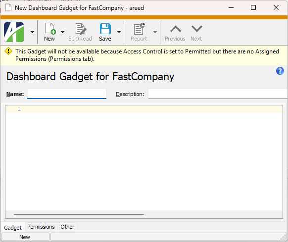
Permissions are assigned to gadgets to determine who has access to them. User permissions also influence which gadgets are visible to a user with full functionality.
- Open the gadget record you need to assign permissions for.
- Select the Permissions tab.
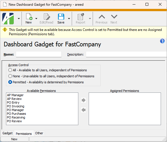
- In the Access Control field, select an option to control who has access to the gadget from the dashboard. Your options are:
- All. All users can see the gadget.
- None. No users can see the gadget.
Permitted. Only users who are assigned a permission which is assigned to the gadget can see the gadget.
Note
If the gadget's access control is "Permitted" and the authorized user's access is "All", the gadget will NOT be available to the user.
-
If you selected "Permitted" in the Access Control field, highlight the permissions to assign to the gadget in the Available Permissions list box. You can use Ctrl and/or Shift selection to select multiple permissions.
Permissions that are flagged as "Obsolete" are not visible in the list box.
-
Click
 to move your selection(s) to the Assigned Permissions list box.
Permissions previously assigned to a gadget and subsequently flagged as "Obsolete" are visible in the list box.
- Save your changes.
How permissions work for gadgets with included sub-gadgets
A single gadget can contain one or more sub-gadgets. The main gadget may be shared by multiple users with differing permissions. In this case, users will only see the included sub-gadgets to which they have permission. This means that gadgets can be developed as separate modules and it's not necessary to copy gadgets just to accommodate differences in permissions.
An include statement can reference a gadget that doesn't exist without producing an error. A gadget that doesn't exist is simply ignored. So the same gadget can be used by different users with different permissions and only the sub-gadgets to which a user has permission will be visible to that user.
Each sub-gadget should include the permission-specific detail. The main gadget which includes the sub-gadgets needs all the permissions assigned to it that are assigned to the individual sub-gadgets.
The following table shows how you might set up permissions for processing POs in Purchasing:
| Sub-gadget | Permissions assigned to gadget |
|---|---|
| PO-Approval | PO Approver |
| PO Manager (so these non-approvers can see the number of POs which need approval) | |
| PO Review (so these non-approvers can see the number of POs which need approval) | |
| PO-New Approval | PO Manager |
| PO Review | |
| PO-Ready for Print | PO Manager |
| PO Review | |
| PO-Need Addendum | PO Manager |
| PO Review | |
| PO-Available for Receiving | PO Manager |
| PO Review | |
| PO Receiving | |
| PO-Partially Received | PO Manager |
| PO Review | |
| PO Receiving | |
| PO-Available for Invoicing | PO Manager |
| PO Review | |
| PO Invoicing | |
| PO-Partially Invoiced | PO Manager |
| PO Review | |
| PO Invoicing |
Edit a gadget
From time to time a gadget may need updating, tweaking, even overhauling.
- Highlight the company folder for the company you need to edit a gadget for.
- Do one of the following:
- If the gadget you need to edit is visible in the dashboard, click the
 icon to enable the gadget for editing.
 - If the gadget you need to edit is not visible in the dashboard but is listed in the Action Lists dropdown, click the gadget name to open it, then click the icon to enable the gadget for editing.
- If the gadget you need to edit is not visible in the dashboard and not listed in the Action Lists dropdown, click the icon, then use the appropriate tab(s) in the Gadgets dialog to locate the gadget name.
Click the gadget name to open it, then click the
icon to enable the gadget for editing.
- If the gadget you need to edit is visible in the dashboard, click the
- In the gadget's title bar, click the icon. The gadget's article opens in edit mode.
- Make changes to the article as needed.
- When you finish, click in the gadget title bar. The gadget is rendered in the dashboard.
Share a gadget
Gadgets often offer features which could be useful to other units in your organization. If you have appropriate permissions, you can create gadgets in one company and share them with other companies. Some minor adjustments to the gadgets may be required depending on the saved answers and filter names available in the other companies.
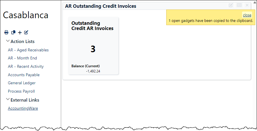
To share a gadget, it must be copied as XML and pasted into a new gadget.
Important
When you copy a gadget, close all gadgets on your dashboard which you do not want copied to the new shared gadget. All open gadgets are included in the XML copy action.
- In the Navigation pane, highlight the company folder which contains the gadget you want to share.
- Open the gadget you want to share in the dashboard.
- Close any gadgets you do not want to include in the copy.
- Click the icon. ActivityHD notifies you of the number of open gadgets copied to the clipboard.
- In the Navigation pane, navigate to the company folder where you want to copy the new gadget, then go to Administration > Setup > Gadgets.
- Click
 . The New Dashboard Gadget window opens.
- Enter a Name and Description for the new gadget.
- In the text area, right-click and select Paste. The gadget's XML is copied into the text area.
- Select the Permissions tab.
- Select the appropriate Access Control option and assign permissions as needed.
- Save your changes. The next time users connect to the company, the new gadget is available to select in the Gadgets dialog.
Macros
Much of the behavior of gadgets is handled through the use of macro statements. Macros are signified in an article by the characters (typically called "delimiters") which set them off. A macro statement begins with << and concludes with >>. The text between the delimiters are the instructions the macro will carry out.
For ActivityHD gadgets, there are three primary types of macro:
- action. An action macro executes an ActivityHD action on a specified folder and filter.
- count. A count macro returns the total number of items in a folder and, optionally, an amount total.
- report. A report macro runs an ActivityHD report.
The instructions a macro carries out depend on the values you assign to the macro's parameters. The parameters can be listed in any order. Some parameters are required and some are optional.
Example
/%Comments, comments, comments.%/
<<action
action: "Open"
package: "Payroll"
folder: "Employees"
label: "Click to open the Employees folder"
>>
In the sections that follow, we will discuss each of the primary ActivityHD macros and the parameters available to each.
The action macro
Syntax
<<action
action: "ActionOption"
package: "Package"
folder: "FolderName"
parameters: "<p><Filter Name='FilterName'/></p>"
label: "HotLinkLabel"
hint: "HintText"
>>
Example
<<action
action: "Open"
package: "Payroll"
folder: "Checks"
parameters: "<p><Filter Name='Ready for direct deposit'/></p>"
label: "Checks ready for DD"
hint: "Click to open the Checks folder showing only the checks which are ready for direct deposit"
>>
Parameter options
- action
The action macro requires an action parameter. The value passed as the ActionOption depends on the folder being acted upon. To see the approximate list of actions available on a particular folder, right-click on the folder. The names of the action options are similar to the names of the shortcut menu commands, but may differ in spelling, case, and spacing (there are no spaces in the action option names). Also, although reports are listed in the shortcut menu, reports are run using the report macro, not an action macro. If you attempt to use an action that isn't available on a given folder, you'll receive a message that the action could not be found.
Expand this link to see a partial list of available action options:
- Open
- New
- NewCopy
- Read
- Edit
- ListEdit
- Change
- Proof
- Merge
- Process
- PrintFinancials (General Ledger > Financial Designs folder)
- Reconcile (Bank Reconciliation > Bank Transactions folder)
- Charges (Accounts Receivable > Customers folder)
- Statements (Accounts Receivable > Customers folder)
- Export (Accounts Receivable > Customers folder)
- Import (Accounts Receivable > Customers folder)
- Pay (Accounts Payable > Invoices folder)
- Disburse (Accounts Payable > Payments folder)
- Print (Payroll > Checks folder)
- Reprint (Payroll > Checks folder)
- DirectDeposit (Payroll > Checks folder)
- ReprintDirectDeposit (Payroll > Checks folder)
- ValidateGLAccounts (Payroll > Checks folder)
- package
The package parameter is required. Typically, this is the name of the ActivityHD package without spaces (e.g., AccountsPayable, AccountsReceivable, etc.). To see the complete list of available packages, go to Administration > Security > Resources and browse the Package column.
- folder
The folder parameter is required. Typically, this is the name of the ActivityHD data folder without spaces (e.g., Invoices, NoteTypes, etc.). To see the complete list of available folders, go to Administration > Security > Resources and filter or sort the Type column for "Data Folder".
- parameters
The parameters parameter (say that ten times fast!) is optional. Use it to provide additional information to the action such as filter names, values for prompting filters, date expressions, etc.
The parameters which are available to an action depend on both the action selected and the folder it is acting upon.
Expand this link to see an example using the parameters parameter with an explanation of the syntax.
Example
<<action
action: "Open"
package: "Payroll"
folder: "Time Sheet Lines"
parameters:
[[<p>
<Filter Name='For 2nd Shift Employees'/>
<Filter Name='? Group'>
<Parameter Name='Group' Value='RegHr'/>
</Filter>
<Filter Name='? Work Date Range'>
<Parameter Name='BeginDate' Expression='begin of prior period of calendar "Weekly"'/>
<Parameter Name='EndDate' Expression='end of prior period of calendar "Weekly"'/>
</Filter>
</p>]]
label: "RegHr Time Sheet Lines this Payroll Run 2nd Shift"
>>
The generic syntax for a filter is <Filter Name='MyFilterName'></Filter>. The filter denoted in red is a non-prompting filter. Since a non-prompting filter has no additional parameters, a shortcut syntax is permissible: <Filter Name='MyFilterName'/>.
The filter in green is a prompting filter, so it must use the generic filter syntax. In addition, since the filter will prompt for a value, we insert a Parameter tag between the opening and closing Filter tags to indicate the parameter being prompted for and the value we want to assign to it. The syntax for a parameter is similar to the shortcut syntax for a filter: <Parameter Name='ParameterName' Value='ParameterValue'/>.
The filter in blue is also a prompting filter. In this case, however, two dates are being prompted for. Since we are writing a macro, we probably don't want to provide explicit dates (we want the macro to be reusable) but instead want to provide a "description" of the dates we need to use. To do that we use date expressions. The following syntax applies for a parameter which derives its value from an expression: <Parameter Name='ParameterName' Expression='ExpressionSyntax'/>.
- label
The label parameter is optional. It allows you to specify text to substitute for the default text that would otherwise be used as the HotLinkLabel. The HotLinkLabel is the text the gadget user clicks to trigger the action statement.
- hint
The hint parameter is optional. You can use the hint parameter to specify text which will display when a user hovers over the HotLinkLabel.
The count macro
The count macro does everything the action macro does plus it shows the total number of items in the folder and, optionally, one of the totals available in the folder's status bar. If filters are applied, the count and any total are restricted to the rows which match the filters. The HotLinkLabel can include tokens to pull the count and/or total into the label. The token for the count is %0; the token for the total is %1. The count and total are active values which update as the values change in the database.
Syntax
<<count
package: "Package"
folder: "FolderName"
parameters: "<p><Filter Name='FilterName'/></p>"
total: "FolderSpecificTotalAmount"
label: "HotLinkLabel"
action: "ActionOption"
action_parameters: "ActionParameters"
report: "ReportName"
report_parameters: "ReportParameters"
hint: "HintText"
bold: "BoldInteger"
highlight: "HighlightInteger"
>>
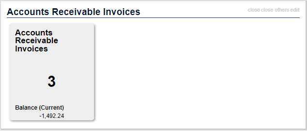
Example 1
<<count
package: "Accounts Payable"
folder: "Invoices"
parameters: "<p><Filter Name='Outstanding Invoices'/></p>"
total: "Invoice Amount"
label: "%0 Outstanding AP Invoices (%1)"
action: "Open"
hint: "Click to open the AP Invoices folder showing outstanding invoices only"
>>
Example 2
In this example, if any AR invoices are found to be over 120 days past due, the results are highlighted; if two or more are past due, the results are also bolded.
<<count
package: "Accounts Receivable"
folder: "Invoices"
parameters: "<p><Filter Name='? Aging Category' Type='Built-In'><Parameter Name='AgingCategory' Value='Over 120'/></Filter></p>"
total: "Balance (Current)"
label: "$%1 (%0 invoices)"
action: "Open"
hint: "Click to open list of invoices over 120 days past due"
bold: 2
highlight: 1
>>
Parameter options
- package
The package parameter is required. Typically, this is the name of the ActivityHD package without spaces (e.g., AccountsPayable, AccountsReceivable, etc.). To see the complete list of available packages, go to Administration > Security > Resources and browse the Package column.
- folder
The folder parameter is required. Typically, this is the name of the ActivityHD data folder without spaces (e.g., Invoices, NoteTypes, etc.). To see the complete list of available folders, go to Administration > Security > Resources and filter or sort the Type column for "Data Folder".
- parameters
The parameters parameter is optional. Use it to provide additional information to the actions such as filter names, values for prompting filters, date expressions, etc.
The parameters which are available to an action depend on both the action selected and the folder it is acting upon.
- total
The total parameter is optional. This parameter allows you to designate any folder total that is valid for the specified folder. The columns available for totaling depend on the folder selected. The value passed to the parameter should be the caption from the column you want to total on.
- label
The label parameter is optional. It allows you to specify text to substitute for the default text that would otherwise be used as the HotLinkLabel. The HotLinkLabel is the text the gadget uses to trigger an action or report.
- action
The action parameter is optional. The action parameter cannot be used if the report parameter is used. The default action is "Open".
- action_parameters
The action_parameters parameter is optional. It is used in conjunction with the action parameter. The default action parameters are the same as those of the parameters parameter.
- report
The report parameter is optional. The report parameter cannot be used if the action parameter is used. The report parameter value is the name of the report to be run.
- report_parameters
The report_parameters parameter is optional. It is used in conjunction with the report parameter.
- hint
The hint parameter is optional. You can use the hint parameter to specify text which will display when a user hovers over the HotLinkLabel.
- bold
The bold parameter is optional. You can use the bold parameter to specify a value which is interpreted as an integer. If the count value equals or exceeds the specified value, the result is bolded.
- highlight
The highlight parameter is optional. You can use the highlight parameter to specify a value which is interpreted as an integer. If the count value equals or exceeds the specified value, the result is highlighted.
The report macro
The simplest way to specify all the dialog options for a report is to use a saved answer that includes the customized filtering options from the report's Selection tab. If the date expressions in saved answers and associated filters are adequate, you can proceed to the Print or Preview action from the report gadget.
Syntax
<<report
package: "Package"
report: "ReportName"
parameters: "<p><Answer Name='ReportProfileName'/> <Print/> <Close/> </p>"
label: "HotLinkLabel"
hint: "HintText"
>>
Example
<<report
package: "Payroll"
report: "Payroll Group Analysis"
parameters: "<p><Answer Name='401k Withheld'/> <Print/> <Close/> </p>"
label: "Print 401k Withheld"
hint: "Click this link to print the Payroll Group Analysis report using the '401k Withheld' saved answer"
>>
Parameter options
- package
The package parameter is required. Typically, this is the name of the ActivityHD package without spaces (e.g., AccountsPayable, AccountsReceivable, etc.). To see the complete list of available packages, go to Administration > Security > Resources and browse the Package column.
- report
The report parameter is required. Typically, this is the name of the ActivityHD report. To see a list of available reports, go to Administration > Security > Resources and filter or sort the Type column for "Report".
- parameters
The parameters parameter is optional. Use it to provide additional information to the report such as a saved answer name (Answer Name).
Expand this link to see a partial list of available report parameters with syntax. For a complete list, see "Dashboard and AAS parameter syntax".The additional parameter elements for a report macro are essentially values and commands which allow control of the report dialog that is associated with the report. These additional parameter elements include:
- <Answer Name='MyReportProfile'/>
- <Preview/>
- <Print/>
- <Email MyAttributes/>
- <Export MyAttributes/>
- <ShowForm/>
- <Close/>
Like the Email and Export parameter elements listed above, some parameter elements require attributes to be passed in order to specify needed details.
As an example, the Export parameter element needs the following attributes to export information in PDF format:
- <FormatType='PortableDocFormat'/>
- <DestinationType='DiskFile'/>
- <DiskFileName='MyPathAndFilename'/>
To export information in .csv or .txt format, the Export parameter element needs the following attributes:
- <FormatType='CharSeparatedValues'/>
- <DestinationType='DiskFile'/>
- <DiskFileName='MyPathAndFilename'/>
- <DiskFilePrompt='True'/>
- <CharFieldDelimiter=''/>
- <CharStringDelimiter=''/>
- <UseReportDateFormat='False'/>
- <UseReportNumberFormat='False'/>
- label
The label parameter is optional. It allows you to specify text to substitute for the default text that would otherwise be used as the HotLinkLabel. The HotLinkLabel is the text the gadget uses to trigger a report.
- hint
The hint parameter is optional. You can use the hint parameter to specify text which will display when a user hovers over the HotLinkLabel.
The tile macro
The tile macro is similar to the count macro except in its presentation format. Instead of a linear text presentation, the tile macro shows a rectangular button (tile) with the count and an optional total.
The tile macro permits both a basic syntax using unnamed parameters and a standard syntax using named parameters.
Basic syntax
The basic syntax of the tile macro is simply <<tile>> with unnamed parameters inside the paired angle brackets. The meaning of the unnamed parameters in order is: package, folder, interest parameters, total. The action is always "Open"; the label is the package and folder; the hint is something on the order of "Open the <package><folder>". The behavior is similar to the behavior when using unnamed parameters in the count macro.
Example
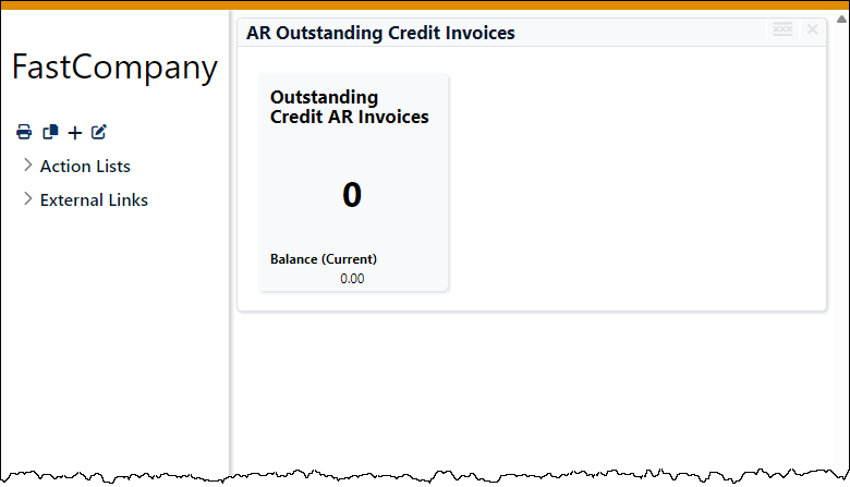
The following tile macro with unnamed parameters shows the count of Accounts Receivable invoices which match the specified filter and also shows the balance as a total.
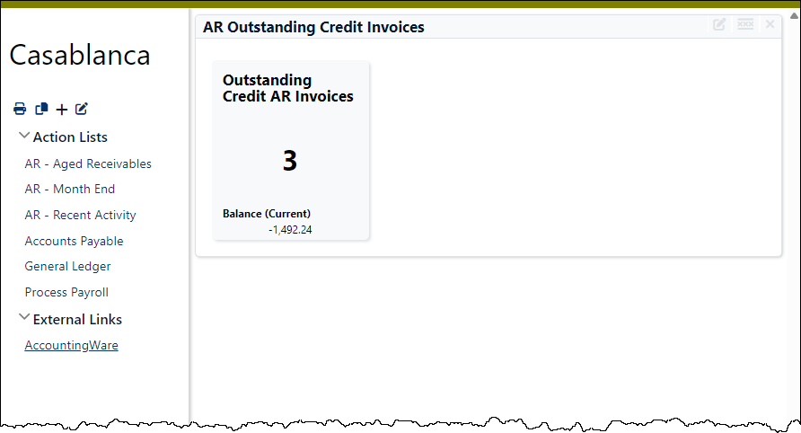
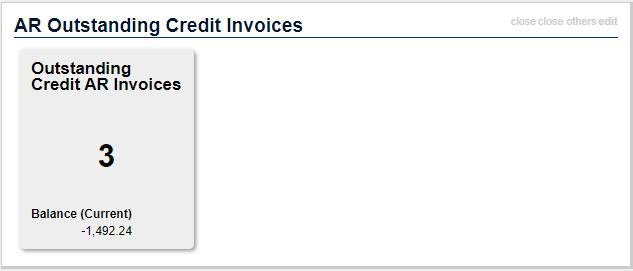
<<tile "Accounts Receivable" "Invoices" "<p><Filter Name='? Aging Category' Type='Built-In'><Parameter Name='AgingCategory' Value='Outstanding Credit'/></Filter></p>" "Balance (Current)">>
Standard syntax
Using named parameters is far more flexible than using unnamed parameters. The syntax for named parameters is described below:
<<tile
package: "Package"
folder: "FolderName"
parameters: "<p><Filter Name='FilterName'/></p>"
total: "FolderSpecificTotalAmount"
label: "HotLinkLabel"
action: "ActionOption"
action_parameters: "ActionParameters"
report: "ReportName"
report_parameters: "ReportParameters"
hint: "HintText"
highlight: "HighlightInteger"
>>
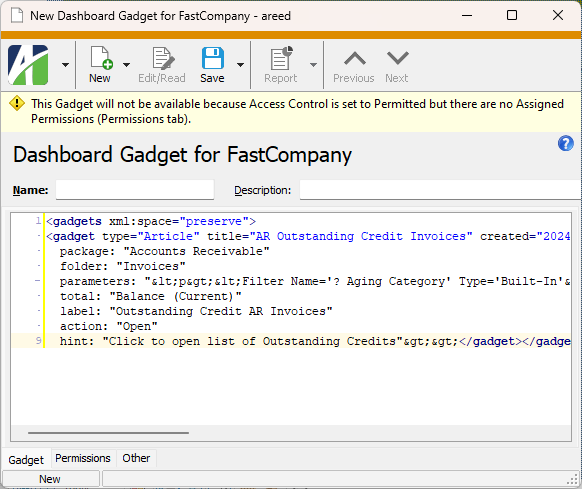
Example
This example is similar to the unnamed parameters example above, but uses named parameters.
<<count
package: "Accounts Receivable"
folder: "Invoices"
parameters: "<p><Filter Name='? Aging Category' Type='Built-In'><Parameter Name='AgingCategory' Value='Outstanding Credit'/></Filter></p>"
total: "Balance (Current)"
label: "Outstanding Credit AR Invoices"
action: "Open"
hint: "Click to open list of Outstanding Credits"
>>
Parameter options
- package
The package parameter is required. Typically, this is the name of the ActivityHD package without spaces (e.g., AccountsPayable, AccountsReceivable, etc.). To see the complete list of available packages, go to Administration > Security > Resources and browse the Package column.
- folder
The folder parameter is required. Typically, this is the name of the ActivityHD data folder without spaces (e.g., Invoices, NoteTypes, etc.). To see the complete list of available folders, go to Administration > Security > Resources and filter or sort the Type column for "Data Folder".
- parameters
The parameters parameter is optional. Use it to provide additional information to the actions such as filter names, values for prompting filters, date expressions, etc.
The parameters which are available to an action depend on both the action selected and the folder it is acting upon.
- total
The total parameter is optional. This parameter allows you to designate any folder total that is valid for the specified folder. The columns available for totaling depend on the folder selected. The value passed to the parameter should be the caption from the column you want to total on.
- label
The label parameter is optional. It allows you to specify text to substitute for the default text that would otherwise be used as the HotLinkLabel. The HotLinkLabel is the text the gadget uses to trigger an action or report.
- action
The action parameter is optional. The action parameter cannot be used if the report parameter is used. The default action is "Open".
- action_parameters
The action_parameters parameter is optional. It is used in conjunction with the action parameter. The default action parameters are the same as those of the parameters parameter.
- report
The report parameter is optional. The report parameter cannot be used if the action parameter is used. The report parameter value is the name of the report to be run.
- report_parameters
The report_parameters parameter is optional. It is used in conjunction with the report parameter.
- hint
The hint parameter is optional. You can use the hint parameter to specify text which will display when a user hovers over the HotLinkLabel.
- highlight
The highlight parameter is optional. You can use the highlight parameter to specify a value which is interpreted as an integer. If the count value equals or exceeds the specified value, the result is highlighted.
To support styling of the results of the new macro, a new Style:Tile gadget is included. This gadget permits a variety of customizations including color, size, etc. This gadget uses the named colors from the Palette:Colors gadget by default.
Simple links
Internal links
In general, links are enclosed in pairs of double brackets: [[Link]]. An internal link can be as simple as the name of the object being linked to.
Examples
[[Import Time Sheets]]
[[Template:Post to AP]]
[[LinkDisplayText|Link]]
Links to files or folders
When creating a link to a file, the default program for the file type is used to open the file.
When creating a link to a folder path without specifying a file name, File Explorer runs and opens to the specified path.
Syntax
[[LinkDisplayText|file: path to file or folder]]
Examples
[[Sample pdf on Desktop|file:\\ComputerName\c$\Users\YourUserName\desktop\SamplePDF.pdf]]
[[My Desktop as Folder|file:\\ComputerName\c$\Users\YourUserName\desktop\]]
Links to websites
A valid URL is automatically interpreted as an external link.
Example
http://www.accountingware.com renders as http://www.accountingware.com.
When creating a link to a website, use the full URL including "http:" or "https:".
Syntax
[[LinkDisplayText|url]]
Example
[[AccountingWare website|http://www.accountingware.com]]
Templates
Fair warning!
The content of this section is not intended for the technologically timid. Proceed at your own risk. May cause drowsiness.
Templates are useful for capturing repeated and complex markup so that the markup can be reused.
The body of a template is a Javascript function of the form function(place,params), where place is the parent DOM Document Object Model element and params is an array of parameters which are passed when the template is instantiated Moved from the abstract (template) to the concrete (an actual instance of the template).. Template code can directly manipulate the DOM by appending children to place. Template code can also return a string to be parsed as markup text and rendered in place.
Example
Suppose a template named "ARAged" is created with the following text:
return(params[1] + ': <<count' +
' package: "Accounts Receivable"'+
' folder: "Invoices"'+
' parameters: "<p><Filter Name=\'? Aging Category\' Type=\'Built-In\'><Parameter Name=\'AgingCategory\' Value=\'' + params[1] + '\'/></Filter></p>"'+
' total: "Balance (Current)"'+
' label: "$%1 (%0 invoices)"'+
' action: "Open"'+
' hint: "Click to open list of '+params[1]+' invoices">>');
The foregoing text can be used to create an article:
*<<template ARAged "Outstanding Credit">>
*<<template ARAged "Not Yet Due">>
*<<template ARAged "Current">>
The result will look something like this:
- Outstanding Credit: $0.00 (0 invoices)
- Not Yet Due: $0.00 (0 invoices)
- Current: $0.00 (0 invoices)
HTML and CSS
In addition to the gadget-specific syntax, the dashboard can also interpret HTML and CSS.
Embedded HTML
To embed HTML code in a gadget, simply enclose valid XHTML between <html> tags.
<html><p>Perform the following steps:</p><ol><li>List Item 1</li><li>List Item 2</li></ol></html>
Embedded iframes
You can even use iframes to pull in content from a website. To do so, enclose the iframe in <html> tags and specify, at a minimum, the source document.
<html><iframe style="width:100%; height:800px;" src="http://www.accountingware.com" /></html>
Custom CSS class wrappers
It's also possible to define a custom CSS class wrapper. The inner text of the wrapper is placed inline between <span> tags of the class(es), or between <div> tags if the inner text starts and ends with a new line. You can define styles for the class in the style sheet. The following example shows the syntax to use to reference the custom class wrapper for a class named .button which creates a button labeled "Click!".
{{button title{Click!}}}
Scripts
You can use inline Javascript scripts when creating dashboard gadgets. The general format for a <script> tag is:
<script show label="label" title="title">Javascript goes here</script>
All qualifiers (show, label, title) are optional.
- show. Causes the Javascript code to render literally in the gadget output.
- label. Causes a clickable link to be created. When the link is clicked, the script is executed.
- title. Adds a hover hint to the clickable link.
If no qualifiers are present, the script is executed when the gadget is rendered. The return value from the script is interpreted as wiki markup text. A place parameter can be passed if direct manipulation of the DOM is needed.
Several formatting options are available for customizing dashboard gadgets. You can create bulleted or numbered lists, checkboxes, tables, and even tabs for grouping multiple gadgets.
Comments
You can insert comments in the body of an article. Comments have no effect on the rendered gadget; they are only visible in the markup. To add comments, enclose them between /% and %/.

Text
Text formatting is useful for emphasis and for setting off section headings.
Bold
To bold text, type two apostrophes before and after the text to be bolded.

Italics
To italicize text, type two forward slashes before and after the text to be italicized.

Bold italics
To bold and italicize text, nest the italics format inside the bold format.

Underline
To underline text, type two underscores before and after the text to be underlined.

Strikethrough
To strike through text, type two dashes before and after the text to be struck through.

Superscript
To superscript text, type two carets before and after the text to be raised.

Subscript
To subscript text, type two tildes before and after the text to be lowered.

Highlight
To highlight text with color, type two "at" symbols before and after the text to be highlighted. The default highlight color is yellow.

Tip
The @@ syntax can accept CSS syntax for styling:

Emdash
To create an emdash, type two dashes surrounded by single spaces where the emdash belongs.

Indentation
To indent text, type a colon in front of the text to be indented. The more colons in front of the text, the greater the indentation.

Monospaced Text (for mimicking code)
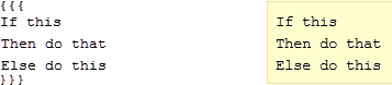
To cause text to display in a monospaced font, surround the text with triple braces. This method works for inline text and multi-line text.

Special characters
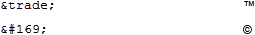
To enter special characters which aren't available on the keyboard or which may be reserved characters used in markup, you can use the equivalent HTML entity name or entity number.
Horizontal rules
To draw a dashed horizontal line, say, to separate some gadget content from the rest, simply type four dashes.

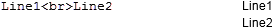
Line Break
A line break can be useful if you need to create separate lines in a table cell or for a list item. To create a line break, type <br>.
Suppressing Formatting
On occasion you may need to render some of the characters used for gadget markup literally. To do so, you can enclose the text within triple braces or in <nowiki> tags. Triple braces will format the content like code (i.e., in a Courier font); the <nowiki> tags will format the content like the rest of the text in the dashboard.

Images
Typically, image files will be external to the dashboard. To insert an image, use this general format: [img[filepath/image.jpg]].
To insert an image inline, use the general format.

You can also left- or right-align an image. To left-align, insert a less than sign (<) immediately after the opening bracket; to right-align, use a greater than sign (>).


You can also link to an internal resource or external resource, so that when the image is clicked, the resource opens.
[img[C:/Images/AccountingWare logo.jpg][Post to AP]] (internal)
[img[C:/Images/AccountingWare logo.jpg][http://www.accountingware.com]] (external)
Headings
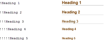
Headings are achieved by typing exclamation points in the front of the line you want to serve as a heading—one exclamation point for each level of heading.
Checkboxes
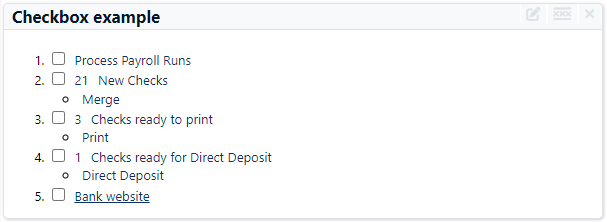
You can display multiple links in a list with checkboxes. You can use checkboxes to mark your progress through a process.
The symbol name for a checkbox option always begins with "chk", and the name must be unique among all other options.
Syntax
<<option symbol_name>>
Example
<<option chkMergeChecks>>
Example
This markup:
#<<option chkProcessPayrollRuns>> <<action Process Payroll "Payroll Runs">>
#<<option chkMergeChecks>> <<count Payroll Checks
"<p><Filter Name='New Checks'/></p>">> <<action Open Payroll Checks
"<p><Filter Name='New Checks'/></p>" "New Checks">>
#*<<action Merge Payroll Checks "" "Merge">>
#<<option chkPrintChecks>> <<count Payroll Checks
"<p><Filter Name='Ready for Print Checks'/></p>">> <<action Open Payroll Checks
"<p><Filter Name='Ready for Print Checks'/></p>" "Checks ready to print">>
#*<<action Print Payroll Checks "" "Print">>
#<<option chkDirectDeposit>> <<count Payroll Checks
"<p><Filter Name='Ready for Direct Deposit'/></p>">> <<action Open Payroll Checks
"<p><Filter Name='Ready for Direct Deposit'/></p>" "Checks ready for Direct Deposit">>
#*<<action "DirectDeposit" Payroll Checks "" "Direct Deposit">>
#<<option chkPayrollBank>> [[Bank website|http://www.accountingware.com]]
...produces this gadget:
Lists
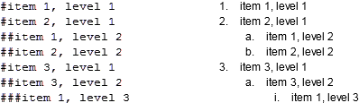
Numbered lists
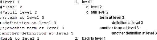
To create numbered lists, type a pound sign in front of the lines you want numbered at the top level, type two pound signs in front of lines you want numbered at the second level, etc.
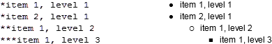
Bulleted lists
To create bulleted lists, type an asterisk in front of the lines you want bulleted at the top level, type two asterisks in front of lines you want bulleted at the second level, etc.
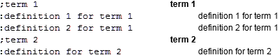
Definition lists
Definition lists present a term formatted in bold followed by the definition indented on the line below. To designate a term, precede it with a semi-colon. To designate a definition, precede it with a colon.
Mixed lists
You can intermingle numbered, bulleted, and definition list items. The first level item in the list should be preceded by the formatting character that denotes the type of list you want to start out with (# for numbered, * for bulleted, etc.). Second level numbered or bulleted items will be preceded by the character that preceded the first level item followed by the formatting character for the type of item you want on the second level. Third level numbered or bulleted items will be preceded by the two characters that preceded the second level items followed by the formatting character for the type of item you want at the third level, and so on. Terms and definitions can be inserted at the desired level by using the number of semi-colons or colons which correspond to that level. Note that with terms and definitions, the term and definition (although indented) share the same level.
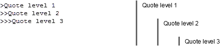
Block quotes
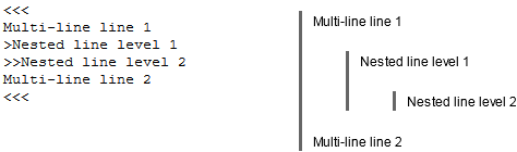
To indicate a block quote, precede the quoted line with a greater than sign (>). For successive levels of block quotes, add additional greater than signs.
Nested block quotes
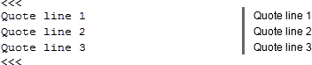
Multi-line block quotes
Block quotes which contain multiple lines are enclosed in triple less than signs (<<<).
Mixed block quotes
You can also have combinations of nested and multi-line block quotes.
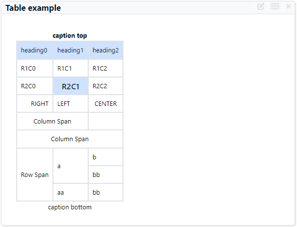
Tables
The contents of a gadget can be arranged in table format. Each cell of the table can contain simple text or even the result of an ActivityHD action statement.
To format a table, use the pipe (|) character to indicate column boundaries.
Example
This markup:
|''caption top''|c
|heading0|heading1|heading2|h
|R1C0|R1C1|R1C2|
|R2C0|!R2C1|R2C2|
| RIGHT|LEFT | CENTER |
|>| Column Span |
|>|>| Column Span |
|Row Span|a|b|
|~|~|bb|
|~|aa|bb|
|caption bottom|c
...produces this table:
Extended tables
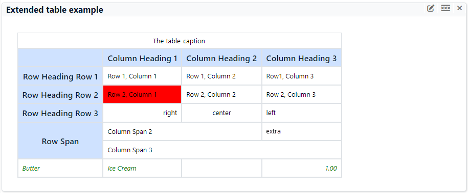
The dashboard supports an alternative table format which uses markup that closely resembles that used by MediaWiki. This format gives you finer control over table attributes, and a single row can span multiple lines of markup.
Example
This markup:
{|
|+ The table caption
!
! Column Heading 1
! Column Heading 2 !! Column Heading 3
|-
! Row Heading Row 1
| Row 1, Column 1
| Row 1, Column 2 || Row1, Column 3
|-
! Row Heading Row 2
|style="background:red"| Row 2, Column 1 || Row 2, Column 2
| Row 2, Column 3
|-
! Row Heading Row 3
|align="right" | right
|align="center" | center || align="left" | left
|-
! rowSpan="2"|Row Span
!colSpan="2"| Column Span 2 || extra
|-
|colSpan="3"| Column Span 3
|- style="font-style: italic; color: green;"
| Butter
| Ice Cream
|
| align="right"| 1.00
|}
...produces this table:
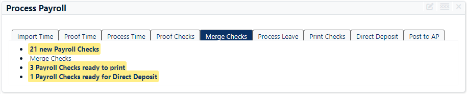
Tabs
Tabs let you organize multiple gadgets into a single display unit.
Example
This markup:
<<tabs txtProcessPayrollTab
"Import Time" "Import Time Sheets" [[Import Time Sheets]]
"Proof Time" "Proof Time Sheets" [[Proof Time Sheets]]
"Process Time" "Process Time Sheets" [[Process Time Sheets]]
"Proof Checks" "Proof Payroll Checks" [[Proof Payroll Checks]]
"Merge Checks" "Merge Payroll Checks" [[Merge Payroll Checks]]
"Process Leave" "Process Leave Plans" [[Process Leave Plans]]
"Print Checks" "Print Payroll Checks" [[Print Payroll Checks]]
"Direct Deposit" "Generate Direct Deposit" [[Generate Direct Deposit]]
>>
...produces this tabbed gadget:
Gadget Record ID
Gadget tab
Permissions tab
- All. All users can see the gadget.
- None. No users can see the gadget.
Permitted. Only users who are assigned a permission which is assigned to the gadget can see the gadget.
Note
If the gadget's access control is "Permitted" and the authorized user's access is "All", the gadget will NOT be available to the user.
The list box shows the permissions available for assignment to the gadget. Permissions that are flagged as "Obsolete" are not visible in the list box.
To assign a permission to a gadget, double-click the permission to move it to the Assigned Permission list box or highlight it and click to move it to the Assigned Permissions list box.
The list box shows the permissions currently assigned to the gadget. Permissions previously assigned to a gadget and subsequently flagged as "Obsolete" are visible in the list box.
To unassign a permission, double-click the permission to move it to the Available Permissions list box or highlight it and click  to move it to the Available Permissions list box.
Custom tab
This tab is visible if custom fields exist for the entity. At a minimum, if there are custom fields, a Fields subtab will be present. One or more additional categories of subtabs may also be visible.
Fields subtab
This tab prompts for values for any custom fields set up for entity records of this entity type. Respond to the prompts as appropriate.
References subtab
This tab is visible if other records reference the current record.
Example
Suppose a custom field exists on PRCodes that references an ARCode. On the ARCode record, on the Custom > References subtab, you can view all the PRCodes which reference that ARCode.
Exchange Folder subtab
This tab is visible only if you set up a custom field with a data type of "Exchange Folder". The label on this tab is the name assigned to the custom field.
This tab shows the contents of the specified Exchange folder.
File subtab
This tab is visible only if you set up a custom field with a data type of "File". The label on the tab is the name assigned to the custom field.
This tab renders the contents of the specified file according to its file type.
Internet Address subtab
This tab is visible only if you set up a custom field with a data type of "Internet Address". The label on this tab is the name assigned to the custom field.
This tab shows the contents of the specified web page.
Network Folder subtab
This tab is visible only if you set up a custom field with a data type of "Network Folder". The label on this tab is the name assigned to the custom field.
This tab shows the contents of the specified network folder.
Attachments tab
The Attachments tab is visible if any record for a given entity has an attachment. If the Attachments tab is not visible, this implies that no record of the entity type has an attachment on it; however, once an attachment is added to any record of the entity type, the Attachments tab will become available.
Change Logs tab
This tab is visible if the user has "Change Logs" access to the associated data folder resource.
The Change Logs pane shows the Change Logs HD view filtered to show all change logs for the selected entity record.
Double-click a row in the pane to drill down to its record in the Change Log window.
Other tab
Developer tab
This tab is visible only when developer features are enabled.
Automation subtab
This subtab shows field names and values for the current data record. Use the information in the subtab to assist when creating automation objects such as bots and import files. The field names and field values can be copied from the text box and pasted directly into your code or application. To copy content from the text box, highlight the content to copy and press Ctrl+C or right-click your selection and select Copy from the context menu.
Export (XML) subtab
This subtab shows the XML syntax for exporting the selected data record. The syntax can be copied from the text box as an exemplar for creating your own automation objects for bots, import files, ActivWebAPI, etc. To copy content from the text box, highlight the content to copy and press Ctrl+C or right-click your selection and select Copy from the context menu.
Import (XML) subtab
This subtab allows you to select a file for import and shows the XML syntax for importing data records. Use the subtab to explore the XML syntax for importing data records. In particular, you can investigate the syntax which results when using Data.Import and ActivWebAPI data POST and DELETE routes.
Change Log (XML) subtab
This subtab is visible only when the Enable Change Logs option is marked in System Options or Company Options (depending on whether the feature applies at the system or the company level). This is the default setting when developer features are enabled.
This subtab allows you to investigate changes to the current data record. The syntax can be copied for use in bots, dashboards, ActivWebAPI, and other automation. To copy content from the text box, highlight the content to copy and press Ctrl+C or right-click your selection and select Copy from the context menu.
Select Statement (SQL) subtab
This subtab allows you to investigate the SQL select statement used to retrieve the current data record. The syntax can be copied as an exemplar for data sources and other automation. To copy content from the text box, highlight the content to copy and press Ctrl+C or right-click your selection and select Copy from the context menu.
| Gadget Name | Description |
|---|---|
| AR - Aged Receivables | AR - Aged Receivables |
| AR - Deposit Activity | AR - Deposit Activity |
| AR - Invoice Activity | AR - Invoice Activity |
| AR - Month End | AR - Month End Procedures |
| AR - Receipt Activity | AR - Receipt Activity |
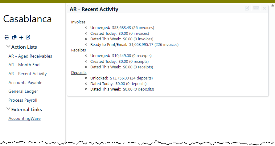
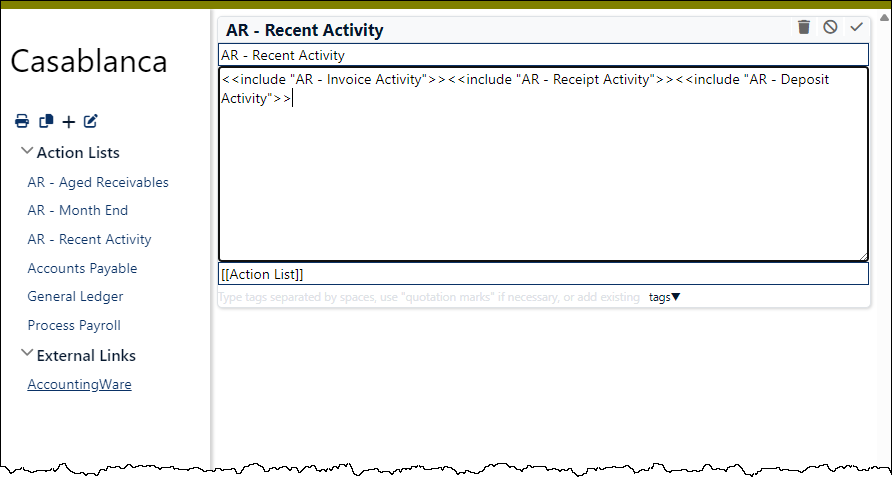
| AR - Recent Activity | AR - Recent Activity |
| Markup | Example markup syntax |
| PR - Process Payroll | PR - Process Payroll |
Gadget security
Common accesses available on gadgets
| Access | A user with this access can... |
|---|---|
| Change | Use the mass change action on gadgets. |
| Change Logs | |
| Custom Fields | Create and edit custom fields for gadgets. |
| Data | Have read-only access to gadgets from anywhere in the software (e.g., field validations, filters, date expressions). |
| Delete | Delete gadgets. |
| Edit | Edit gadget records. |
| Export | Export gadget records from ActivityHD. |
| Import | Import gadget records into ActivityHD. |
| New | Create new gadget records. |
| Read | Have read-only access to gadget records. |
| Report | Run reports with gadget information. |
| Report Designs | Create and edit report designs with gadget information. This access enables the Report Designs button on the Output tab of report dialogs. |
| Shared Answers | Create and edit saved answers related to gadgets. |
| Shared Filters | Create and edit shared filters on gadgets. |
| Visible | View the Gadgets folder in the Navigation pane. |
|
5225 S Loop 289, #207 Lubbock, TX 79424 806.687.8500 | 800.354.7152 |
© 2025 AccountingWare, LLC All rights reserved. |